Century
Complete character set
ABCDEFGHIJKLMNOPQRSTUVWXYZ
abcdefghijklmnopqrstuvwxyz
0123456789
?!-,.:;$
Sample text
In principio creavit Deus caelum et terram. Terra autem erat inanis et vacua, et tenebrae erant super faciem abyssi: et spiritus Dei ferebatur super aquas. Dixitque Deus: Fiat lux. Et facta est lux. Et vidit Deus lucem quod esset bona: et divisit lucem a tenebris. Appellavitque lucem Diem, et tenebras Noctem: factumque est vespere et mane, dies unus. Dixit quoque Deus: Fiat firmamentum in medio aquarum: et dividat aquas ab aquis. Et fecit Deus firmamentum, divisitque aquas, quae erant sub firmamento, ab his, quae erant super firmamentum. Et factum est ita. Vocavitque Deus firmamentum, Caelum: et factum est vespere et mane, dies secundus. Dixit vero Deus: Congregentur aquae, quae sub caelo sunt, in locum unum: et appareat arida. Et factum est ita. Et vocavit Deus aridam Terram, congregationesque aquarum appellavit Maria. Et vidit Deus quod esset bonum.
Download TrueType® font - 15 KB
About the design
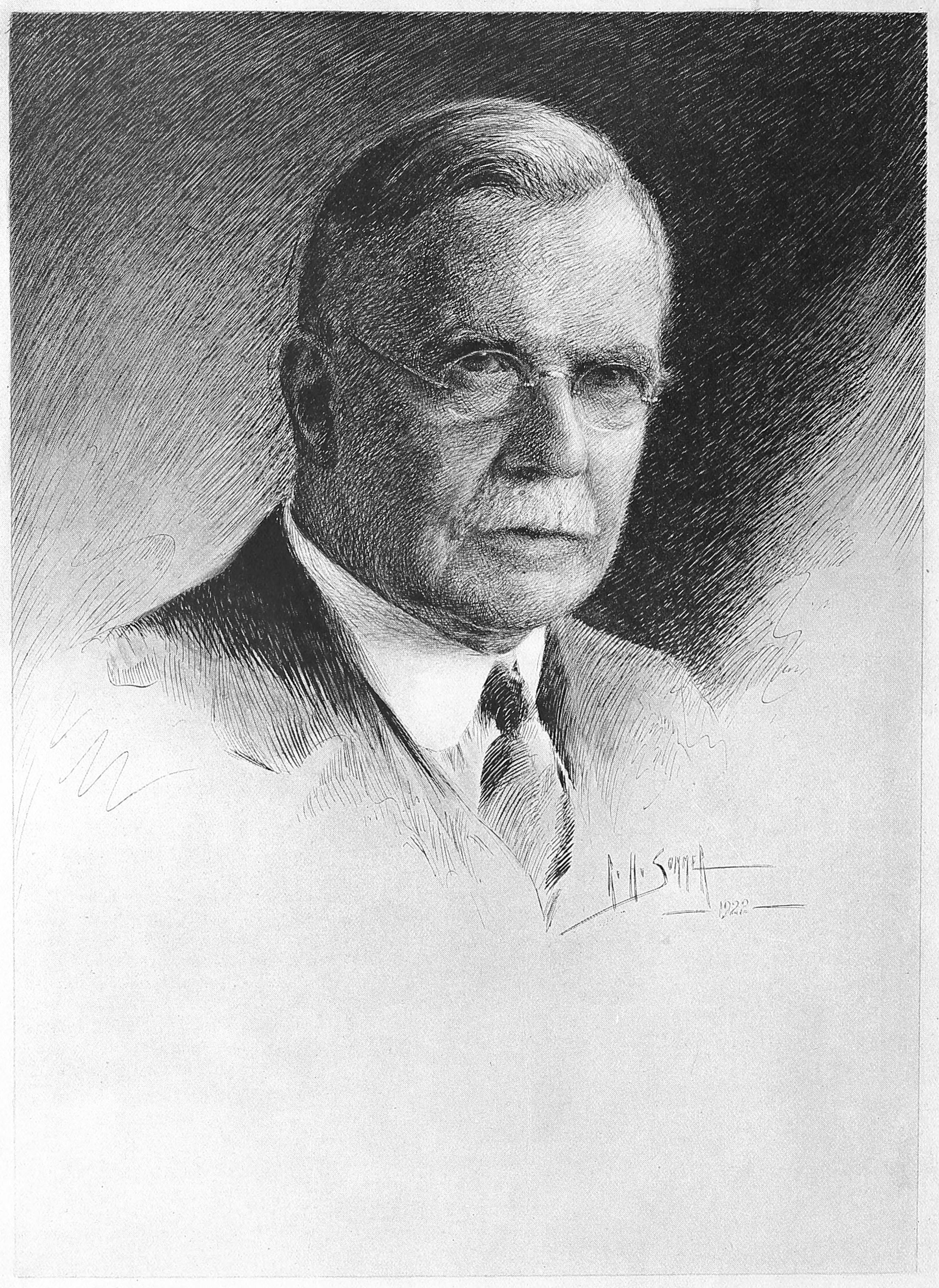
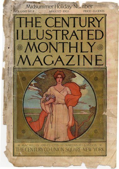
Century is a family of serif type faces particularly intended for body text. The family originates from a first design, Century Roman cut by American Type Founders designer Linn Boyd Benton in 1894 for master printer Theodore Low De Vinne, for use in The Century Magazine.[1] ATF rapidly expanded it into a very large family, first by Linn Boyd and later by his son Morris.
Century is based on the “Scotch” genre, a style of type of British origin which had been popular in the United States from the early nineteenth century and is part of the “Didone” genre of type popular through the entire nineteenth century.[2][3] Its design emphasizes crispness and elegance, with strokes ending in fine tapers, ball terminals and crisp, finely pointed serifs. However, compared to many earlier typefaces in the genre, stroke contrast is quite low, creating a less sharp and highly readable structure.[4] With ATF no longer operating, a wide variety of variants and revivals with varying features and quality are available.
Despite originating in the nineteenth century, use of the typeface remains strong for periodicals, textbooks, and literature. The Supreme Court of the United States requires that briefs be typeset in Century family type.[5] According to Charles Shaw, “The rugged simplicity of the Century family of types has made it an enduring favorite of American typographers for almost one hundred years. Beginning as foundry type, Century has withstood a series of technical transformations into Linotype, Monotype, Ludlow, phototype, transfer type, digital type, and Xerox-like ‘toner type’.